Line Graph
A line graph is a type of chart used to display data over time. It is particularly useful for showing trends and changes in data, and is commonly used in various fields such as economics, science, and social studies.
Components of a Line Graph
There are several key components of a line graph:
- Title: The title describes the content or subject of the graph.
- Axis Labels: The horizontal axis (x-axis) and vertical axis (y-axis) are labeled to indicate the categories or values being represented.
- Data Points: Data points are the individual values or measurements that are plotted on the graph.
- Lines: Lines connect the data points to show the overall trend or pattern in the data.
- Legend: If the graph represents multiple data sets, a legend may be included to identify each line and its corresponding data.
Interpreting a Line Graph
When interpreting a line graph, it's important to consider the following:
- Trends: Look for patterns or trends in the data, such as increasing or decreasing values over time.
- Relationships: Identify any relationships between the variables being plotted on the graph.
- Anomalies: Note any outliers or unusual data points that deviate from the overall trend.
- Comparisons: Compare the different lines on the graph to understand how the data sets relate to each other.
Example:
Here's a simple example of a line graph showing the monthly sales of a company over a year:

In this example, the x-axis represents the months of the year, the y-axis represents the sales figures, and each line represents the monthly sales data. By analyzing the graph, you can see how the company's sales fluctuate over the year and identify any overall trends in the data.
.◂Math Worksheets and Study Guides Second Grade. Fractions Greater Than or Less Than 1/2
Study Guide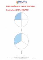 Fractions Greater Than or Less Than 1/2
  Worksheet/Answer key
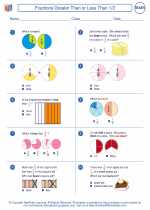 Fractions Greater Than or Less Than 1/2
  Worksheet/Answer key
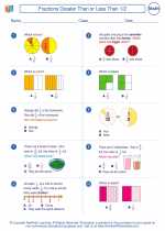 Fractions Greater Than or Less Than 1/2
  Worksheet/Answer key
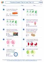 Fractions Greater Than or Less Than 1/2
  Worksheet/Answer key
 Fractions and Decimals
  Worksheet/Answer key
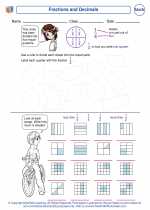 Fractions and Decimals
  Vocabulary/Answer key
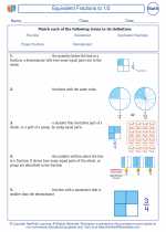 Fractions Greater Than or Less Than 1/2

 Worksheet/Answer key
 Worksheet/Answer key
 Worksheet/Answer key
 Worksheet/Answer key
 Worksheet/Answer key
 Vocabulary/Answer key

Create And Print more Fractions worksheets with Comparing Fractions, Equivalent Fractions, and Simplifying Fractions
The resources above cover the following skills:
Number and Operations (NCTM)
Understand numbers, ways of representing numbers, relationships among numbers, and number systems.
Understand and represent commonly used fractions, such as 1/4, 1/3, and 1/2.