Line Chart
A line chart is a type of graph that is used to display data over time. It is made up of a series of data points that are connected by straight lines. Line charts are useful for showing trends and patterns in data over a period of time.
Key Features of a Line Chart:
- X and Y Axis: The horizontal axis (X-axis) represents the time period or categories, while the vertical axis (Y-axis) represents the values being measured.
- Data Points: Each data point on the chart represents a specific value at a particular time or category.
- Line: The lines on the chart connect the data points, showing the trend or pattern in the data.
How to Create a Line Chart:
- Collect Data: Gather the data that you want to represent on the line chart.
- Choose Axes: Determine which variable will be plotted on the X-axis and which will be plotted on the Y-axis.
- Plot Data Points: Plot the data points on the chart using the appropriate time periods or categories on the X-axis and the corresponding values on the Y-axis.
- Connect Data Points: Connect the data points with a line to show the trend or pattern in the data.
- Add Labels: Label the axes and provide a title for the chart to make it easy to understand.
Study Guide:
To create a line chart, follow these steps:
- Collect the data that you want to represent on the chart.
- Determine the time periods or categories to be plotted on the X-axis and the values to be plotted on the Y-axis.
- Plot the data points on the chart, using the appropriate time periods or categories on the X-axis and the corresponding values on the Y-axis.
- Connect the data points with a line to show the trend or pattern in the data.
- Add labels to the axes and provide a title for the chart.
Remember to use a line chart when you want to display data over time and show trends or patterns. It is a great way to visualize how values change over a period of time and identify any significant patterns or fluctuations.
Practice creating line charts with different sets of data to improve your skills in interpreting and presenting data visually.
Good luck with your studies!
.◂Math Worksheets and Study Guides Fifth Grade. Common Factors
Study Guide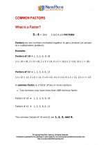 Common Factors
  Worksheet/Answer key
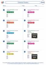 Common Factors
  Worksheet/Answer key
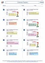 Common Factors
  Worksheet/Answer key
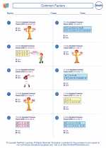 Common Factors
  Worksheet/Answer key
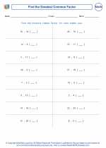 Greatest Common Factor of numbers not greater than 24
  Worksheet/Answer key
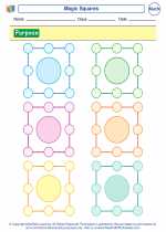 Magic Squares
  Worksheet/Answer key
 Star Mathematics
  Vocabulary/Answer key
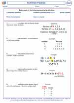 Common Factors

 Worksheet/Answer key
 Worksheet/Answer key
 Worksheet/Answer key
 Worksheet/Answer key
 Worksheet/Answer key
 Worksheet/Answer key
 Vocabulary/Answer key

The resources above cover the following skills:
Algebra (NCTM)
Use mathematical models to represent and understand quantitative relationships.
Model problem situations with objects and use representations such as graphs, tables, and equations to draw conclusions.