Histogram
A histogram is a type of bar graph that represents the distribution of data. It is used to show the frequency of values within a data set. In a histogram, the horizontal axis represents the range of values, and the vertical axis represents the frequency or relative frequency of those values.
Key Concepts
- Frequency: The number of times a particular value occurs in the data set.
- Range: The span of values covered by the data set.
- Bar Height: The height of each bar in the histogram represents the frequency or relative frequency of the corresponding value.
- Intervals: The range of values is divided into intervals or bins, and each bar represents the frequency of values within that interval.
Creating a Histogram
To create a histogram, follow these steps:
- Determine the range of the data set.
- Divide the range into intervals or bins.
- Count the frequency of values within each interval.
- Draw a bar for each interval, with the height of the bar representing the frequency of values within that interval.
Example
Suppose we have the following data set representing the scores of 20 students in a math test:
| Score | 85 | 92 | 78 | 90 | 72 | 85 | 88 | 75 | 83 | 92 | 80 | 85 | 78 | 90 | 88 | 82 | 85 | 90 | 88 | 78 |
|---|
Let's create a histogram to represent this data:

Study Tips
Here are some tips for studying histograms:
- Practice creating histograms from given data sets.
- Understand the concept of frequency and how it relates to the height of the bars in a histogram.
- Study different types of histograms, such as relative frequency histograms and cumulative frequency histograms.
- Learn to interpret histograms and draw conclusions about the distribution of data.
With these study tips and a good understanding of the key concepts, you'll be well-prepared to work with histograms in your math studies!
.◂Math Worksheets and Study Guides Fifth Grade. Elapsed Time
Study Guide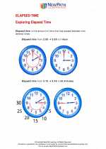 Elapsed Time
  Activity Lesson
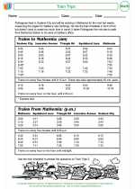 Train Trips Activity Lesson
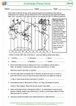 Archimedes Phones Home Worksheet/Answer key
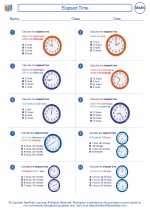 Elapsed Time Worksheet/Answer key
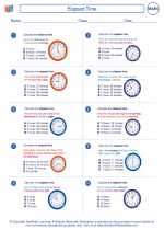 Elapsed Time Worksheet/Answer key
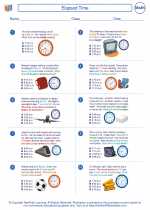 Elapsed Time Worksheet/Answer key
 Measuring Time and Temperature Worksheet/Answer key
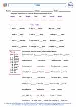 Time Worksheet/Answer key
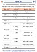 Elapsed Time
Activity LessonActivity LessonWorksheet/Answer keyWorksheet/Answer keyWorksheet/Answer keyWorksheet/Answer keyWorksheet/Answer keyWorksheet/Answer keyThe resources above cover the following skills:
Knowledge of Measurement: Students will identify attributes, units, or systems of measurements or apply a variety of techniques, formulas, tools, or technology for determining measurements.
Applications in Measurement: Calculate equivalent measurements.
Determine start, elapsed, and end time (Assessment limit: Use the nearest minute).