Area Chart
An area chart is a type of graph that is used to display quantitative data over a set period of time. It is similar to a line chart, but the area between the line and the x-axis is filled with color, making it easier to visualize the magnitude of the values over time. Area charts are commonly used to show the trend of values over time and to compare the values of different categories.
Key Features of Area Charts
- X-Axis: The horizontal axis represents the categories or time periods.
- Y-Axis: The vertical axis represents the quantitative values being measured.
- Area Fill: The area between the line and the x-axis is filled with color to represent the magnitude of the values.
- Multiple Series: Area charts can display multiple data series, allowing for easy comparison.
- Stacked Area Chart: In a stacked area chart, the different data series are stacked on top of each other, showing the total magnitude as well as the individual contributions.
Advantages of Area Charts
- Visualizing Trends: Area charts make it easy to visualize the trend of values over time.
- Comparing Categories: They allow for easy comparison of values across different categories.
- Highlighting Magnitude: The filled area helps to highlight the magnitude of the values.
How to Create an Area Chart
- Collect your quantitative data and organize it by categories or time periods.
- Choose a suitable tool or software to create the area chart, such as Microsoft Excel, Google Sheets, or other data visualization platforms.
- Enter your data into the charting tool and select the area chart type.
- Customize the chart by adding axis labels, titles, and colors to make it visually appealing and easy to understand.
- Review and analyze the area chart to draw insights from the data.
Study Guide
If you are studying area charts, here are some key points to focus on:
- Understand the purpose and use of area charts.
- Learn how to read and interpret area charts, including understanding the x-axis, y-axis, and area fill.
- Practice creating area charts using different sets of data to understand their application in real-world scenarios.
- Compare area charts with other types of graphs, such as line charts and bar charts, to understand when to use each type of visualization.
- Explore advanced variations of area charts, such as stacked area charts, and understand their significance in data analysis.
By mastering the concept of area charts, you will be able to effectively visualize and analyze quantitative data, making informed decisions based on trends and comparisons.
.◂Math Worksheets and Study Guides Sixth Grade. Division
Study Guide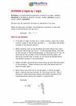 Division
  Worksheet/Answer key
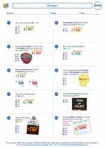 Division
  Worksheet/Answer key
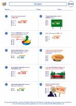 Division
  Worksheet/Answer key
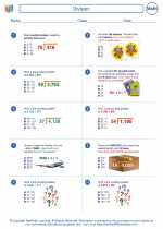 Division

 Worksheet/Answer key
 Worksheet/Answer key
 Worksheet/Answer key

The resources above cover the following skills:
Connections to the Grade 6 Focal Points (NCTM)
Number and Operations: Students' work in dividing fractions shows them that they can express the result of dividing two whole numbers as a fraction (viewed as parts of a whole). Students then extend their work in grade 5 with division of whole numbers to give mixed number and decimal solutions to division problems with whole numbers. They recognize that ratio tables not only derive from rows in the multiplication table but also connect with equivalent fractions. Students distinguish multiplicative comparisons from additive comparisons.