Line Graphs
A line graph is a type of chart used to display data. It is particularly useful for showing trends and changes over time.
Components of a Line Graph
- X-axis: The horizontal axis that represents the independent variable, usually time or another continuous variable.
- Y-axis: The vertical axis that represents the dependent variable, typically the quantity being measured or observed.
- Line: A line that connects data points to show the relationship between the variables.
- Data points: Individual points plotted on the graph representing specific values of the variables.
Creating a Line Graph
To create a line graph, follow these steps:
- Identify the variables to be plotted on the graph.
- Select a suitable scale for the axes.
- Plot the data points on the graph.
- Connect the points with a line to show the trend or pattern.
Interpreting a Line Graph
When interpreting a line graph, consider the following:
- Look for trends, patterns, or relationships between the variables.
- Check the scale of the axes to understand the magnitude of the data.
- Identify any significant changes or anomalies in the data.
Example
Suppose we want to plot the temperature over a week. Here's how the data might look:
| Day | Temperature (°C) |
|---|---|
| Monday | 18 |
| Tuesday | 20 |
| Wednesday | 22 |
| Thursday | 25 |
| Friday | 23 |
| Saturday | 19 |
| Sunday | 17 |
Using this data, we can create a line graph to visualize the temperature changes over the week.
Review Questions
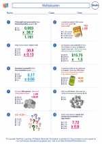
.◂Math Worksheets and Study Guides Sixth Grade. Multiplication
Study Guide Multiplication
  Worksheet/Answer key
 Multiplication
  Worksheet/Answer key
 Multiplication
  Worksheet/Answer key
 Multiplication

 Worksheet/Answer key
 Worksheet/Answer key
 Worksheet/Answer key

The resources above cover the following skills:
The Number System
Compute fluently with multi-digit numbers and find common factors and multiples.
Fluently multiply and divide multi-digit whole numbers using the standard algorithm. Express the remainder as a whole number, decimal, or simplified fraction; explain or justify your choice based on the context of the problem.