Line Graph
A line graph is a type of chart that displays information as a series of data points called 'markers' connected by straight line segments. It is used to show how data changes over time or to compare changes in different sets of data.
Key Components of a Line Graph
- X-axis: The horizontal axis that represents the independent variable (e.g., time, categories).
- Y-axis: The vertical axis that represents the dependent variable (e.g., quantity, measurements).
- Data Points: The individual values plotted on the graph, typically represented by markers such as dots or squares.
- Line Segments: The lines that connect the data points to show the trend or pattern in the data.
- Title and Labels: A title to describe the content of the graph and labels for the axes to provide context for the data being presented.
Creating a Line Graph
To create a line graph, follow these steps:
- Collect Data: Gather the data points you want to represent on the graph.
- Choose Axes: Determine which variable will be on the x-axis and which will be on the y-axis.
- Scale the Axes: Decide on the range and intervals for each axis based on the data values.
- Plot Data Points: Plot each data point on the graph, pairing the x and y values.
- Connect Data Points: Draw line segments to connect the data points, showing the trend or pattern in the data.
- Add Title and Labels: Include a descriptive title and label the axes to provide context for the graph.
Interpreting a Line Graph
When interpreting a line graph, consider the following:
- Trend: Look for any overall patterns or trends in the data shown by the direction of the line segments.
- Relationships: Determine the relationship between the variables represented on the axes. Does one variable affect the other?
- Changes over Time: If the x-axis represents time, observe how the data changes over different time periods.
- Comparisons: Compare the trends of multiple lines on the same graph to identify similarities or differences in the data sets.
Study Guide
Here are some key points to remember when working with line graphs:
- Understand the purpose of a line graph and when it is appropriate to use one.
- Be familiar with the key components of a line graph and how to create one.
- Practice interpreting line graphs to identify trends, relationships, and changes in data.
- Compare and contrast different data sets using line graphs to draw meaningful conclusions.
Remember to always label the axes, title the graph appropriately, and use a consistent scale to accurately represent the data.
For any further assistance or practice problems, feel free to reach out!
.◂Math Worksheets and Study Guides Eighth Grade. Solving equations and inequalities
Study Guide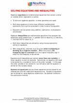 Solving equations and inequalities
  Worksheet/Answer key
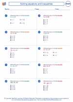 Solving equations and inequalities
  Worksheet/Answer key
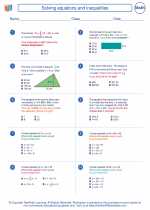 Solving equations and inequalities
  Worksheet/Answer key
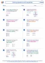 Solving equations and inequalities

 Worksheet/Answer key
 Worksheet/Answer key
 Worksheet/Answer key

The resources above cover the following skills:
Algebra (NCTM)
Represent and analyze mathematical situations and structures using algebraic symbols.
Develop an initial conceptual understanding of different uses of variables.