Using Graphs to Analyze Data
Graphs are a powerful tool for analyzing and interpreting data. They allow us to visualize and understand the relationships and patterns within a dataset. There are several types of graphs commonly used for data analysis, including bar graphs, line graphs, and pie charts.
Bar Graphs
A bar graph is a visual representation of data in which the data values are represented by the height or length of bars. Bar graphs are useful for comparing different categories or groups of data. They can be used to show discrete data, such as the number of students in each grade level, or to compare the frequency or percentage of different categories.
Line Graphs
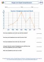
A line graph is a type of graph that displays information as a series of data points connected by straight lines. Line graphs are useful for showing trends or changes over time. They are often used to display continuous data, such as temperature readings over a period of time or stock prices over a year.
Pie Charts
A pie chart is a circular graph that is divided into slices to represent the relative size of different categories within a dataset. Pie charts are useful for showing the proportions of a whole. They are often used to display percentage distributions, such as the percentage of different types of fruits in a fruit basket or the percentage of expenses in a budget.
Study Guide
To effectively use graphs to analyze data, it's important to understand the following concepts:
- Data Interpretation: Learn how to read and interpret the information presented in different types of graphs.
- Graph Construction: Understand how to construct different types of graphs based on the given dataset and the purpose of the analysis.
- Choosing the Right Graph: Know when to use a bar graph, line graph, or pie chart based on the nature of the data and the analysis objectives.
- Data Analysis: Practice analyzing graphs to identify trends, patterns, and relationships within the data.
- Real-World Applications: Explore real-world examples where graphs are used to analyze and interpret data, such as economic trends, population demographics, and scientific research.
By mastering these concepts, you'll be able to effectively use graphs to analyze and interpret data in various contexts.
Happy graphing!
[Using Graphs To Analyze Data] Related Worksheets and Study Guides:
.◂Math Worksheets and Study Guides Eighth Grade. Using graphs to analyze data
 Worksheet/Answer key
 Worksheet/Answer key
 Worksheet/Answer key
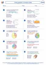
 Worksheet/Answer key
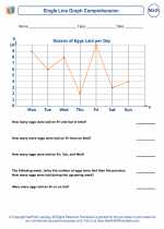
 Worksheet/Answer key
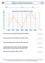
 Worksheet/Answer key
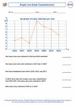
 Worksheet/Answer key