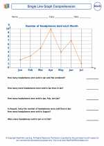
Graphs in Mathematics
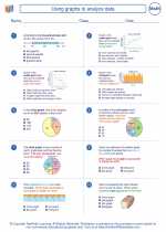
In mathematics, a graph is a visual representation of data that shows the relationship between two or more variables. Graphs are used to represent and analyze mathematical functions, equations, and real-life situations. There are several types of graphs commonly used in mathematics, including line graphs, bar graphs, pie charts, and scatter plots.
Types of Graphs
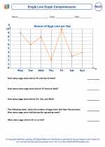
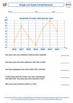
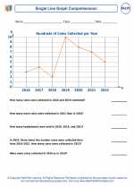
- Line Graphs: Line graphs are used to show the relationship between two variables. They are particularly useful for displaying data that changes over time.
- Bar Graphs: Bar graphs represent data using rectangular bars of different heights or lengths. They are often used to compare different categories of data.
- Pie Charts: Pie charts are circular graphs divided into sectors to represent numerical proportions. They are useful for showing the parts of a whole.
- Scatter Plots: Scatter plots are used to display the relationship between two sets of data. Each point on the graph represents a single observation.
Key Concepts
When working with graphs in mathematics, it's important to understand the following key concepts:
- Coordinates: Graphs are typically plotted on a coordinate plane, with an x-axis (horizontal) and a y-axis (vertical).
- Intercepts: The x-intercept is the point at which a graph crosses the x-axis, and the y-intercept is the point at which a graph crosses the y-axis.
- Slope: The slope of a line on a graph represents the rate of change between two variables. It is calculated as the rise over the run.
- Linear Equations: The graph of a linear equation is a straight line. The equation of a line can be written in the form y = mx + b, where m represents the slope and b represents the y-intercept.
Study Guide
When studying graphs in mathematics, it's important to practice creating and interpreting different types of graphs. Here are some key steps to include in your study guide:
- Understand the purpose and characteristics of each type of graph (line graphs, bar graphs, pie charts, scatter plots).
- Practice plotting points on a coordinate plane and identifying the coordinates of specific points.
- Learn how to calculate and interpret the slope of a line on a graph.
- Work on solving and graphing linear equations using the slope-intercept form.
- Explore real-life applications of graphs, such as interpreting graphs of distance vs. time or temperature vs. time.
By mastering these concepts and practicing with a variety of graphing exercises, you can develop a strong understanding of graphs in mathematics.
Good luck with your studies!
.◂Math Worksheets and Study Guides Eighth Grade. Using graphs to analyze data
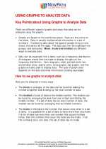
 Worksheet/Answer key
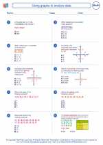
 Worksheet/Answer key
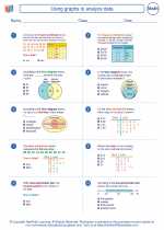
 Worksheet/Answer key
 Worksheet/Answer key
 Worksheet/Answer key
 Worksheet/Answer key
 Worksheet/Answer key