What is an Area Chart?
An area chart is a type of data visualization that is used to display quantitative data over a set period of time. It is similar to a line chart, but the area between the line and the x-axis is filled with color, making it easier to see the magnitude of values over time. Area charts are commonly used to show trends and patterns in data, and to compare the relative sizes of different categories.
How to Create an Area Chart?
To create an area chart, you will need a set of data that includes a series of values over a specific time period or categories. The x-axis represents the time or categories, while the y-axis represents the quantitative values. Here are the steps to create an area chart:
- Organize your data: Arrange your data in a table with columns for the time period or categories, and the corresponding quantitative values.
- Select the data: Highlight the data you want to include in the area chart.
- Insert the chart: In your spreadsheet software or data visualization tool, select "Area Chart" as the chart type, and insert your data.
- Customize the chart: You can customize the appearance of the chart by adding a title, axis labels, and choosing different colors for the areas.
- Interpret the chart: Once the chart is created, analyze the patterns and trends in the data to draw insights and make comparisons.
Key Concepts to Understand
When learning about area charts, it's important to understand the following key concepts:
- X-axis and Y-axis: The x-axis represents the time period or categories, while the y-axis represents the quantitative values being measured.
- Area Filling: The area between the line and the x-axis is filled with color to visually represent the magnitude of the values.
- Stacked Area Chart: In a stacked area chart, multiple areas are stacked on top of each other, making it easy to compare the total size of different categories over time.
- Normalized Area Chart: This type of area chart shows the relative proportions of different categories by normalizing the areas so that they all have the same height.
Study Guide for Area Charts
Here are some study guide questions to help you understand and master the concept of area charts:
- What is the main purpose of using an area chart to visualize data?
- How does an area chart differ from a line chart?
- Explain the process of creating an area chart using a specific dataset.
- What are the advantages of using a stacked area chart over a regular area chart?
- Discuss a real-world example where an area chart would be an effective way to present data.
- What are some best practices for labeling and formatting an area chart to make it easy to understand?
◂Math Worksheets and Study Guides Third Grade. Solids and Faces
 Worksheet/Answer key
 Worksheet/Answer key
 Worksheet/Answer key
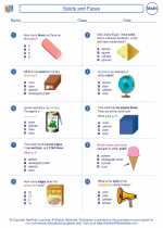
 Worksheet/Answer key
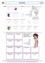
 Worksheet/Answer key