Maps, Charts, Graphs, and Diagrams
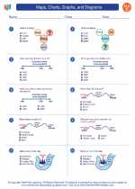
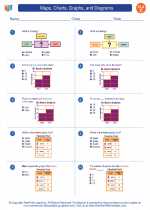
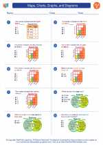
Maps, charts, graphs, and diagrams are visual representations of information and data. They are used to organize and present data in a way that makes it easier to understand and analyze. Understanding how to read and interpret these visual tools is an important skill in many subjects, including geography, science, and social studies.
Maps
A map is a visual representation of an area, showing geographical features, cities, roads, and other important information. Maps are used to navigate, understand the physical features of a location, and analyze patterns and trends.
Charts
Charts are visual representations of data, often in the form of bars, lines, or pie slices. They are used to compare and contrast different sets of information and show relationships and trends in the data.
Graphs
Graphs are visual representations of mathematical relationships or data. They can be used to show trends, patterns, and relationships between different variables. Common types of graphs include line graphs, bar graphs, and pie charts.
Diagrams
Diagrams are visual representations of processes, systems, or structures. They are used to explain how something works, show the parts of a system, or illustrate a concept or idea.
Study Guide
- What is the purpose of a map?
- How are charts and graphs different?
- Give an example of a diagram and explain its purpose.
- Explain how a bar graph is used to represent data.
- Why are maps important in geography and history?
[Maps, Charts, Graphs, And Diagrams] Related Worksheets and Study Guides:
.◂English Language Arts Worksheets and Study Guides Third Grade. Maps, Charts, Graphs, and Diagrams

 Worksheet/Answer key
 Worksheet/Answer key
