Using Tables and Charts
Tables and charts are visual representations of data that help organize and present information in a clear and easy-to-understand format. They are commonly used in math to display numerical data and make it easier to analyze and interpret.
Tables
Tables are organized into rows and columns, with each cell containing a specific piece of data. They are useful for comparing different categories of information and displaying data that can be easily looked up or compared.
For example, a table might be used to show the scores of students on a test, with each row representing a different student and each column representing different subjects or components of the test.
Charts
Charts, such as bar graphs, line graphs, and pie charts, are visual representations of data that make it easier to identify patterns and trends. They are often used to show how data changes over time, compare different categories, or illustrate proportions.
For example, a bar graph might be used to compare the number of books read by students in different grades, with each bar representing a grade level and the height of the bar representing the number of books read.
Uses in Math
In math, tables and charts are used to organize and analyze numerical data, make predictions, and draw conclusions. They can be used to solve word problems, interpret information from real-world situations, and support mathematical reasoning.
Overall, tables and charts are valuable tools for organizing and presenting data in a way that makes it easier to understand and interpret, and they are essential for developing math skills and understanding mathematical concepts.
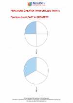
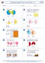
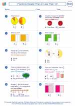
.◂Math Worksheets and Study Guides Second Grade. Fractions Greater Than or Less Than 1/2
 Worksheet/Answer key
 Worksheet/Answer key
 Worksheet/Answer key
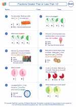
 Worksheet/Answer key
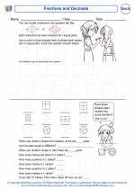
 Worksheet/Answer key
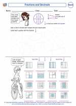
 Vocabulary/Answer key