Histograms
A histogram is a type of bar graph that represents the frequency distribution of a set of data. It is used to show the distribution of numerical data and helps to visualize the shape, center, and spread of the data.
Components of a Histogram
1. Bars: The bars on a histogram represent the different intervals or ranges of the data. The height of each bar corresponds to the frequency or count of data points within that interval.
2. X-axis: The x-axis of a histogram represents the intervals or categories of the data. It is a number line that shows the range of values being analyzed.
3. Y-axis: The y-axis of a histogram represents the frequency or count of data points within each interval. It measures how often a particular value or range of values occurs in the data set.
Creating a Histogram
To create a histogram, follow these steps:
- Choose the number of intervals or bins for the data.
- Determine the range of the data and divide it into the chosen number of intervals.
- Count the number of data points that fall into each interval.
- Draw a bar for each interval, where the height of the bar corresponds to the frequency of data points in that interval.
- Label the x-axis and y-axis appropriately.
- Title the histogram to indicate the data being represented.
Interpreting a Histogram
When interpreting a histogram, consider the following:
- Shape: Is the distribution symmetric, skewed left, or skewed right?
- Center: Where is the center of the data? Is there a single peak or multiple peaks?
- Spread: How spread out is the data? Are there any outliers?
Study Guide
Here are some key points to remember about histograms:
- A histogram is a type of bar graph used to display the frequency distribution of numerical data.
- The x-axis represents the intervals or categories of the data, while the y-axis represents the frequency or count of data points within each interval.
- Creating a histogram involves dividing the data into intervals, counting the frequency of data points in each interval, and drawing bars to represent the frequency distribution.
- When interpreting a histogram, consider the shape, center, and spread of the data to gain insights into the distribution.
Remember to practice creating and interpreting histograms with different sets of data to strengthen your understanding of this important visual representation of data.
[Histograms] Related Worksheets and Study Guides:
.◂Math Worksheets and Study Guides Fourth Grade. Measurement

 Activity Lesson
 Activity Lesson
 Activity Lesson
 Worksheet/Answer key
 Worksheet/Answer key
 Worksheet/Answer key
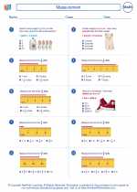
 Worksheet/Answer key
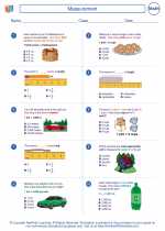
 Worksheet/Answer key
 Worksheet/Answer key
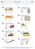
 Worksheet/Answer key
 Worksheet/Answer key
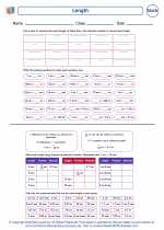
 Worksheet/Answer key
 Worksheet/Answer key
 Vocabulary/Answer key
 Vocabulary/Answer key
 Vocabulary/Answer key
