Bar Graphs
A bar graph is a way of representing data using rectangular bars of different heights or lengths. The bars can be either vertical or horizontal. Bar graphs are useful for comparing and displaying the frequency, size, or other measures of different categories or groups of data.
Parts of a Bar Graph:
1. Title: A clear and descriptive title that summarizes the data being presented.
2. Axes: The vertical axis (y-axis) represents the measured values, while the horizontal axis (x-axis) represents the categories or groups of data.
3. Bars: Rectangular bars that represent the data for each category. The height or length of the bars corresponds to the value of the data being represented.
Creating a Bar Graph:
To create a bar graph, follow these steps:
- Choose the appropriate categories or groups of data to be represented on the x-axis.
- Select the scale for the y-axis, ensuring that it covers the range of the data values and is easy to read and understand.
- Draw the bars for each category, making sure they are equally spaced and of the correct height or length based on the data values.
- Add a title and labels for the axes to provide context and clarity.
- Include a key or legend if the graph represents multiple sets of data.
Interpreting a Bar Graph:
When interpreting a bar graph, consider the following:
- Look for patterns or trends in the data by comparing the heights or lengths of the bars.
- Identify the category with the highest or lowest value by examining the bar heights or lengths.
- Read the axes to understand the scale and context of the data being represented.
- Use the information presented to draw conclusions and make comparisons between the categories.
Study Guide:
Here are some key concepts to remember when working with bar graphs:
- Understanding the purpose of a bar graph and when to use it to represent data.
- Identifying the parts of a bar graph, including the title, axes, and bars.
- Creating a bar graph by selecting appropriate categories, scaling the axes, and drawing the bars accurately.
- Interpreting a bar graph by analyzing the lengths or heights of the bars and drawing conclusions based on the data presented.
Remember to practice creating and interpreting bar graphs using different sets of data to strengthen your understanding of this important visual representation tool.
.◂Math Worksheets and Study Guides Eighth Grade. Three dimensional geometry/Measurement

 Worksheet/Answer key
 Worksheet/Answer key
 Worksheet/Answer key
 Worksheet/Answer key
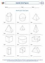
 Worksheet/Answer key
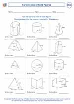
 Worksheet/Answer key
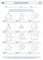
 Worksheet/Answer key
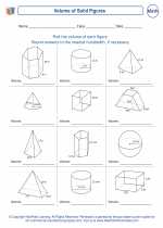
 Worksheet/Answer key
 Worksheet/Answer key
 Worksheet/Answer key
 Worksheet/Answer key