Pie Chart Study Guide
What is a Pie Chart?
A pie chart is a circular statistical graphic that is divided into slices to illustrate numerical proportions. The arc length of each slice is proportional to the quantity it represents. It is a popular way to visualize data and is often used in business, education, and other fields to show the composition of a whole.
How to Create a Pie Chart
To create a pie chart, follow these steps:
- Collect Data: Gather the data that you want to represent in the pie chart.
- Calculate Percentages: Calculate the percentage that each data category contributes to the total.
- Draw the Circle: Draw a circle to represent the whole data set.
- Divide the Circle: Divide the circle into slices, with each slice representing a data category. The size of each slice is proportional to the percentage it represents.
- Add Labels: Label each slice with the corresponding data category and percentage.
Key Concepts
When working with pie charts, it's important to understand the following key concepts:
- Whole: The entire circle represents the whole data set.
- Slices: Each slice represents a portion of the whole, with the size of the slice determined by the percentage it represents.
- Percentages: The percentage of each data category is calculated based on its contribution to the whole.
- Labels: Labels are used to identify each slice and the corresponding data category.
Example
Suppose you have the following data on the favorite fruits of a group of people:
- Apples: 30%
- Oranges: 25%
- Bananas: 20%
- Grapes: 15%
- Other: 10%
To represent this data in a pie chart, you would create a circle and divide it into slices based on the percentages. Each slice would be labeled with the corresponding fruit.
Conclusion
Pie charts are a useful tool for visualizing data and understanding the composition of a whole. By following the steps for creating a pie chart and understanding key concepts, you can effectively represent and interpret data using this graphical method.
[Pie Chart] Related Worksheets and Study Guides:
.◂Math Worksheets and Study Guides Fourth Grade. Money

 Activity Lesson
 Activity Lesson
 Activity Lesson
 Worksheet/Answer key
 Worksheet/Answer key
 Worksheet/Answer key
 Worksheet/Answer key
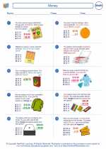
 Worksheet/Answer key
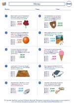
 Worksheet/Answer key
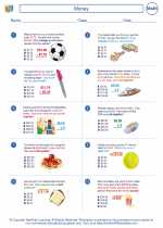
 Worksheet/Answer key