Pie Chart Study Guide
What is a Pie Chart?
A pie chart is a circular statistical graphic that is divided into slices to illustrate numerical proportions. The size of each slice is proportional to the quantity it represents.
Parts of a Pie Chart
A pie chart consists of the following parts:
- Title: The name of the chart, describing the data being represented.
- Slices: The "pieces" of the pie that represent different categories or values.
- Labels: Each slice is labeled with the category or value it represents.
- Legend: A key that explains the color or pattern used to represent each category.
How to Create a Pie Chart
- Collect the data you want to represent in the pie chart.
- Calculate the percentage or angle that each category will occupy in the circle.
- Draw a circle and divide it into sections proportional to the percentages or angles calculated.
- Add labels and a legend to the chart to make it clear and easy to understand.
Interpreting a Pie Chart
When interpreting a pie chart, it's important to look at the size of each slice in relation to the whole pie. This allows for easy comparison of the relative sizes of the different categories or values.
Example
Suppose you have a pie chart representing the favorite fruits of a group of people. The chart may show that 40% prefer apples, 30% prefer bananas, and 30% prefer oranges. The pie chart would have three slices, with the largest representing apples, followed by bananas and oranges.
[Pie Chart] Related Worksheets and Study Guides:
.◂Math Worksheets and Study Guides Fifth Grade. Congruent Shapes
Study Guide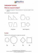 Congruent Shapes
  Worksheet/Answer key
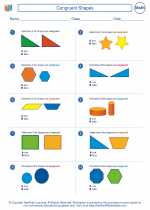 Congruent Shapes
  Worksheet/Answer key
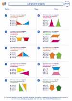 Congruent Shapes
  Worksheet/Answer key
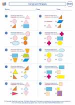 Congruent Shapes

 Worksheet/Answer key
 Worksheet/Answer key
 Worksheet/Answer key

The resources above cover the following skills:
Geometry (NCTM)
Analyze characteristics and properties of two- and three-dimensional geometric shapes and develop mathematical arguments about geometric relationships.
Identify, compare, and analyze attributes of two- and three-dimensional shapes and develop vocabulary to describe the attributes.
Explore congruence and similarity.