Charts
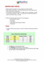
Charts are visual representations of data, used to help people understand and interpret numerical information. They are useful for displaying and comparing different sets of data, and for identifying trends and patterns. There are several types of charts commonly used in math and statistics, including bar charts, line charts, pie charts, and scatter plots.
Types of Charts
- Bar Chart: A bar chart uses rectangular bars to represent the values of different categories or groups. The length of each bar is proportional to the value it represents.
- Line Chart: A line chart connects data points with straight lines, showing the trend of a variable over time or another continuous variable.
- Pie Chart: A pie chart is a circular chart divided into sectors, where each sector represents a proportion of the whole. It is useful for showing the relative sizes of different categories within a data set.
- Scatter Plot: A scatter plot uses dots to represent the values of two different variables. It is useful for showing the relationship between two variables and identifying any correlation between them.
How to Create a Chart
To create a chart, you first need to organize your data into categories and numerical values. Once your data is organized, you can choose the appropriate type of chart to represent it. Many software programs and online tools, such as Microsoft Excel or Google Sheets, have built-in features for creating charts from data sets. These tools allow you to input your data, choose the type of chart you want to create, and customize the appearance and layout of the chart to best represent your data.
Reading and Interpreting Charts
When reading a chart, it's important to pay attention to the labels on the axes, the title of the chart, and any other relevant information provided. This will help you understand what the chart is representing and how to interpret the data it presents. Look for trends, patterns, and outliers in the data, and consider what they might indicate about the information being displayed.
Study Guide
Here are some key points to remember when studying charts:
- Understand the different types of charts and when to use each type.
- Learn how to create charts using software programs or online tools.
- Practice reading and interpreting charts to identify trends, patterns, and correlations in the data.
- Review the importance of labels, titles, and other elements in a chart to ensure accurate interpretation.
By understanding how to create and interpret charts, you can effectively communicate numerical information and make informed decisions based on data analysis.
[Charts] Related Worksheets and Study Guides:
.◂Math Worksheets and Study Guides Fifth Grade. Graphs and Tables

 Worksheet/Answer key
 Worksheet/Answer key
 Worksheet/Answer key
