Bar Graphs
A bar graph is a visual representation of data using bars of different heights or lengths. It is a way to show how data is distributed and compare different categories or groups.
Parts of a Bar Graph:
1. Title: A clear and descriptive title that tells what the bar graph is about.
2. Bars: Vertical or horizontal bars representing the data for each category.
3. X-axis: The horizontal line on the graph that shows the categories or groups being compared.
4. Y-axis: The vertical line on the graph that shows the scale or values being measured.
How to Create a Bar Graph:
1. Identify the categories or groups you want to compare.
2. Choose a scale for the y-axis that will best represent the data.
3. Draw bars for each category, making sure they are equally spaced and the same width.
4. Label each bar with the corresponding category or group.
5. Add a title to the graph.
Interpreting a Bar Graph:
1. Look at the height or length of each bar to compare the values for each category.
2. Check the scale on the y-axis to understand the range of values being represented.
3. Use the title and labels to understand what the graph is showing.
Study Guide:
Here are some key points to remember about bar graphs:
- What is a bar graph and how is it used?
- Parts of a bar graph (title, bars, x-axis, y-axis).
- Steps to create a bar graph.
- Interpreting a bar graph.
Practice drawing and interpreting bar graphs using different sets of data. Pay attention to the scale, labels, and titles to understand the information being presented.
Now that you have a good understanding of bar graphs, you can use them to visually represent and compare data in different categories or groups.
[Bar Graph] Related Worksheets and Study Guides:
.◂Math Worksheets and Study Guides Sixth Grade. Graphs

 Activity Lesson
 Worksheet/Answer key
 Worksheet/Answer key
 Worksheet/Answer key
 Worksheet/Answer key
 Worksheet/Answer key
 Worksheet/Answer key
 Worksheet/Answer key
 Worksheet/Answer key
 Worksheet/Answer key
 Worksheet/Answer key
 Worksheet/Answer key
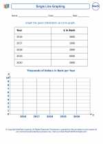
 Worksheet/Answer key
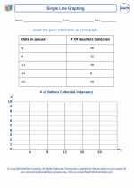
 Worksheet/Answer key
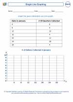
 Worksheet/Answer key
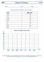
 Worksheet/Answer key