Bar Chart Study Guide
A bar chart is a way to display data visually using horizontal or vertical bars. Each bar represents a category, and the length or height of the bar corresponds to the value of that category. Bar charts are commonly used to compare different categories or track changes over time.
Key Components of a Bar Chart
- Categories: The different groups or items being compared, represented on the x-axis (horizontal bar chart) or y-axis (vertical bar chart).
- Values: The numerical data that is being represented by the length or height of the bars.
- Axes: The x-axis and y-axis provide a scale for the categories and values.
- Title: A descriptive title that summarizes the data being displayed.
- Labels: Labels on the axes and bars provide context and help interpret the data.
Types of Bar Charts
There are different types of bar charts, including:
- Vertical Bar Chart: Bars are displayed vertically, with the categories on the x-axis and the values on the y-axis.
- Horizontal Bar Chart: Bars are displayed horizontally, with the categories on the y-axis and the values on the x-axis.
- Grouped Bar Chart: Multiple sets of bars are grouped together to compare values within each category.
- Stacked Bar Chart: Bars are stacked on top of each other, with each segment representing a different part of the whole value.
How to Create a Bar Chart
To create a bar chart, follow these steps:
- Choose the appropriate type of bar chart based on the data and the comparison being made.
- Collect the data and categorize it into different groups or items.
- Determine the scale and range of the axes based on the values in the data.
- Create the axes and label them with the categories and values.
- Draw the bars to represent the values for each category.
- Add a title and labels to provide context and interpretation for the chart.
Example
Here's an example of a simple vertical bar chart:

In this example, the categories (A, B, C, D) are displayed on the x-axis, and the values (20, 30, 25, 35) are displayed on the y-axis. Each bar represents the value for a specific category, allowing for easy comparison.
Study Tips
To master bar charts, consider the following tips:
- Practice creating bar charts using different sets of data to become familiar with the process.
- Pay attention to the scale of the axes and ensure it accurately represents the data without distorting the visual comparison.
- Experiment with different types of bar charts to understand their unique uses and advantages.
- Use color, patterns, or labels to differentiate bars and make the chart more visually appealing and informative.
By understanding the key components, types, and creation process of bar charts, you can effectively visualize and compare data in a clear and meaningful way.
[Bar Chart] Related Worksheets and Study Guides:
.◂Math Worksheets and Study Guides Fourth Grade. Shapes

 Worksheet/Answer key
 Worksheet/Answer key
 Worksheet/Answer key
 Worksheet/Answer key
 Worksheet/Answer key
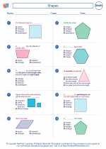
 Worksheet/Answer key
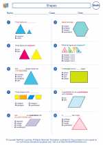
 Worksheet/Answer key
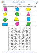
 Worksheet/Answer key
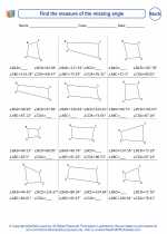
 Worksheet/Answer key
 Worksheet/Answer key
 Worksheet/Answer key
 Vocabulary/Answer key
 Vocabulary/Answer key
 Vocabulary/Answer key