Graphs Study Guide
What is a Graph?
A graph is a visual representation of data that shows the relationship between different sets of information. Graphs are used to make complex data easier to understand and analyze.
Types of Graphs
There are several types of graphs, each designed to represent different kinds of data:
- Bar Graphs: Used to compare different categories of data.
- Line Graphs: Show the change in data over time.
- Pie Charts: Display parts of a whole, where each category represents a proportion of the entire set of data.
- Scatter Plots: Show the relationship between two sets of data.
- Title: Describes the content of the graph.
- Axis Labels: Identify what each axis represents (e.g., time, quantity).
- Legend: Explains the meaning of different colors or patterns used in the graph.
- Data Points: Actual data values represented on the graph.
- Decide on the type of graph that best represents your data.
- Gather your data and organize it into categories or time periods.
- Select the appropriate scale for your graph's axes.
- Plot your data points and label the axes and data points accordingly.
- Add a title and legend if necessary.
- Review and revise your graph for accuracy and clarity.
- Economics: To show trends in market data.
- Science: To visualize experimental results and relationships between variables.
- Business: To display sales figures and financial data.
- Education: To teach students how to interpret and create graphs.
Parts of a Graph
Common elements of a graph include:
How to Create a Graph
To create a graph, follow these steps:
Uses of Graphs
Graphs are used in various fields and disciplines, including:
Conclusion
Graphs are powerful tools for visualizing and understanding data. By mastering the different types of graphs and their uses, you can effectively communicate complex information and make informed decisions based on data analysis.
[Graphs] Related Worksheets and Study Guides:
.◂Math Worksheets and Study Guides Fourth Grade. Tables and Graphs
Study Guide Tables and Graphs
  Activity Lesson
 Pie Chart - Blank
  Activity Lesson
 Classroom Chaos
  Activity Lesson
 Mary`s Many Movements
  Worksheet/Answer key
 Tables and Graphs
  Worksheet/Answer key
 Tables and Graphs
  Worksheet/Answer key
 Tables and Graphs
  Worksheet/Answer key
 Tables and Graphs
  Worksheet/Answer key
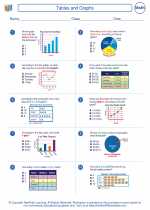 Tables and Graphs
  Worksheet/Answer key
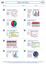 Tables and Graphs
  Worksheet/Answer key
 Student Pictograph
  Worksheet/Answer key
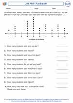 Line Plot - Fundraiser
  Worksheet/Answer key
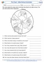 Pie Chart - After-School Activities

 Activity Lesson
 Activity Lesson
 Activity Lesson
 Worksheet/Answer key
 Worksheet/Answer key
 Worksheet/Answer key
 Worksheet/Answer key
 Worksheet/Answer key
 Worksheet/Answer key
 Worksheet/Answer key
 Worksheet/Answer key
 Worksheet/Answer key

The resources above cover the following skills:
DATA ANALYSIS
Interpret data displayed in a circle graph.